Last Updated: 2025-01-31 19:20:28
Curator 101: Essential Setup
Mark Bingham
Curator Experience Lead
August 10, 2021
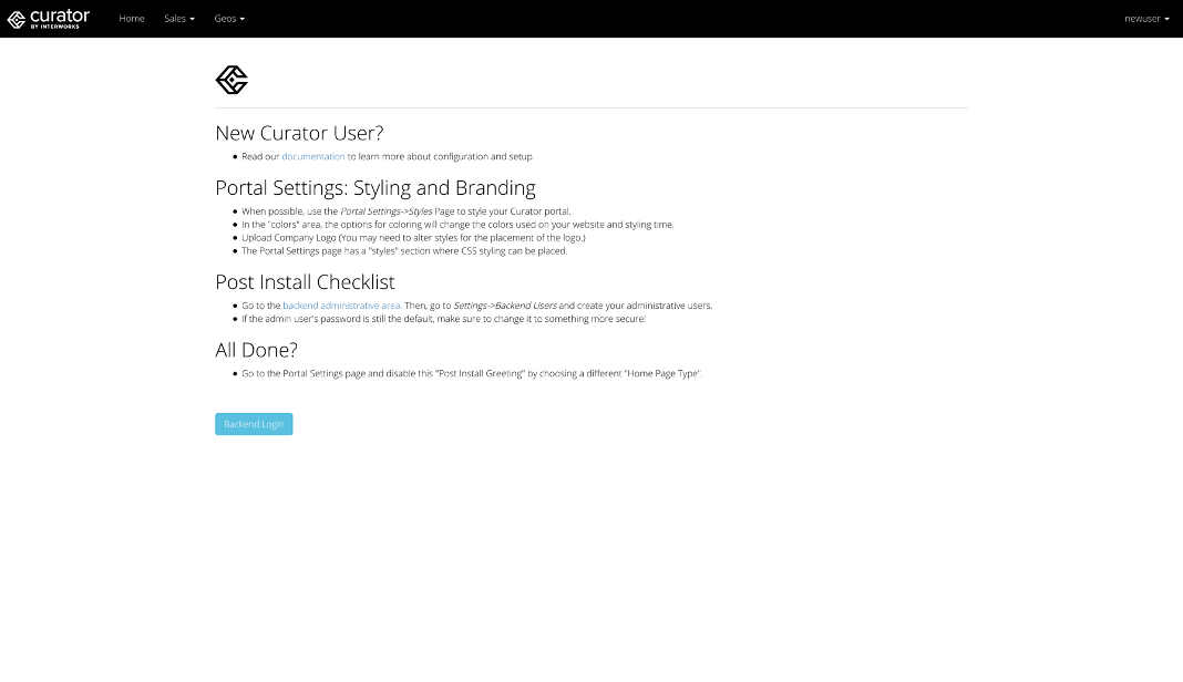
You’ve got your brand new Curator and it probably looks something like this:

“Ahhhh, the smell of a freshly opened Curator,” you may think to yourself as you see all that lies ahead. Curator has a lot to offer, but where to begin? You might be the kind of person who reads the manual (or in this case, our documentation), or you might be the kind of person who just dives in and clicks around, tinkering away through trial-and-error. But today, we’ll just focus on the essentials; you can save the specifics for later, after that new smell has worn off.
We’ll get you set up with everything in no time, but keep in mind that this outline can also serve as a go-to guide when introducing a new team member to managing content on Curator. So sit back, crack open your fresh Curator and let’s get going.
0. Browser Setup
Here’s a quick pro tip: many of the settings don’t have a live preview (yet!) – one way to help ease the confusion around what the impact of each item will be is opening a tab into the backend (where you’ll control your configuration options) and a second tab for your frontend to refresh the page after changing to see what’s new or changed. This way, you can save settings on the backend and quickly check out your changes on the frontend by simply switching tabs. One last pro tip: you can always crack open a new tab with this button on the backend:

1. Homepage
Having the homepage instructions shout out how to set up Curator might not be the most useful for people visiting your site, so let’s get that changed up. I’d recommend taking a look at our various demos for examples of all the homepage types. Once you’ve found one you like, head to the backend under Settings > Curator > Portal Settings > Home tab, and change the Homepage Type from Post Install to whatever looks best. Nothing showing up? If you haven’t added any content to your page, this is a good one to revisit after adding some dashboards and pages.
2. Navigation
Next, we need to figure out how to find all the content you’re so seamlessly going to display. Jump over to Settings > Curator > Portal Settings > Menu tab. We’ve got a couple of menu options, and these are a bit more self-explanatory (as always, check out our demos for inspo). Your Navigation selection will impact which options you’ve got in the subnavigation options as well, so be sure to look through them all to land on the one that looks best for your site.
3. Brand / Logo
Now we’re on to the chef’s recommendation: ~styling~. Head over to Settings > Curator > Portal Settings > Brand tab. Add a new name in the Portal Name input for your site; that’s what shows up in the browser tab: You can also upload a logo, choose your font and favicon (the logo in the browser tab). If you think your logo looks off, try using the Logo Padding input to adjust the space around your logo. Here’s a sample format to get you started: 10px 10px 10px 10px. The corresponding values there relate to: top right bottom left.
4. Styles / Colors
Now, you can head over to Settings > Curator > Portal Settings > Styles tab. This one is much more straightforward (with more features to come!). Start by picking the biggies: Main Body Background Color, Main Body Text Color, Navigation Background Color and Navigation Text Color. Once you’ve got that set up, the rest of the details are much easier to fill in. Struggling? I’d recommend Adobe’s Color Wheel or Coolors.co. Don’t see options you’d like? Want to move some things around? Reach out to our support desk if you’ve already purchased Curator, or talk to your InterWorks Account Exec if you’re currently on a trial – either way we can help you out with some light custom styling.
5. Features
This is where the most functionality on Curator is driven (hence the name!). A quick passthrough on your initial setup will certainly be helpful, but this is a great one to revisit after you start rolling things out to your audience. Feel free to peruse through the Settings > Curator > Portal Settings > Features tab. There’s a lot of functionality, and our recommendation is to start small; it’s easier to add something new than take something away – people will get pretty used to the features right away. Try just turning on three-five features first to see what you (and especially yours users) like. Don’t want to read through all the details? Here are our quick picks for the essentials:
- Refresh Dashboard Thumbnails
- Export Image
- Export PDF
- Export CSV
- Favorites
- Fullscreen
- Report Builder (email option, too)
- Subscriptions
- Search
6. Publishing a Dashboard
Now you’re ready to add content and start seeing some things in action! On the backend, head over to Tableau > Dashboards (or PowerBI > Dashboards) section, and click NewDashboard. All that’s required here is to select your Site, Project, Workbook and Dashboard from the dropdown. The rest is set to autopopulate/add to your menu structure (though you can un-check that; it’s down at the bottom of the page). There are some additional setup options in the Misc and Advanced tabs you can check through. But I’d recommend re-visiting those after taking a look on the frontend to make sure everything is set up how you’ve expected.
7. Navigation Structure
Now for the final finesse: wrapping up the navigation we picked in step #2. Head over to Content > Reorder Navigation on the backend, and drag/drop to your heart’s content! You may be missing a dropdown placeholder. If so, head over to Content > Navigation, and click NewMenu Link. Select DropdownPlaceholder for Link Type then type in the title and click Save. You can head back to Reorder menu, and drag the content under that placeholder.
A Springboard for Possibility
The best is yet to come! Now that you're ready to go with your Curator instance, the rest is gravy - beautiful, customizable, endlessly configurable gravy. As you continue to experiment with Curator, be sure to check back on the Curator blog for info about new features, deep dives and examples of how to leverage them in distinct use cases, looks at our growing Curator and Experience teams, and more. Have fun with your new Curator and remember that we're always here to help. Enjoy the ride!

Managing a self-hosted web platform can be time-consuming, costly, and complex. If you’re currently self-hosting Curator, migrating to our SaaS platform can unlock a world of advantages designed to make your analytics experience seamless and hassle-free, freeing your team to create further impact on your business.

Recently, Tableau has been encouraging the use of connected apps for external applications, instead of using trusted tickets. All of Tableau’s recent embedding features require connected apps. Since this only deals with behind the scenes authentication, there is no impact to the end user. In our effort to remain closely aligned with Tableau, Curator is transitioning to only using connected apps.

Curator has added the feature to be able to send mark commenting data to a webhook. With the widespread use of API integration platforms, this really opens the doorway to virtually unlimited use cases.
